Research in Spacecraft Propulsion Technology
Summary
The Propulsion Research Center at NASA/MSFC identifies, researches and develops technologies for use in "in-space" propulsion of spacecraft, typically for interplanetary missions, such as going to Mars. Research scientists there have been working with electric propulsion (EP) engines which, currently, are best suited to fast propulsion of lightweight craft.
Devices are built and tested in specialized laboratory facilities to demonstrate the technologies which may potentially go into future EP engines. Most of these devices generate plasmas of one sort or another, therefore diagnostic measurements of the working plasmas are an important component of the programs. In recent months, one researcher working with these diagnostic measurements has been using Origin as a graphics package for the presentation of research results, mainly for publication in open literature.

Creating the Origin Graph
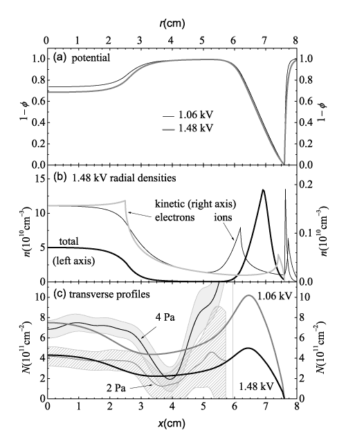
A typical graph created during the analysis of a plasma is shown. The graph employs multiple axes, or layers, to properly visualize the data. In addition, the area fill feature for Origin's Line plots has been utilized to create bands marking data error bars. Finally, several text labels, including a graph and several axis and layer titles, were included to increase the readability of the graph. Note that Greek symbols are included in the axis titles.

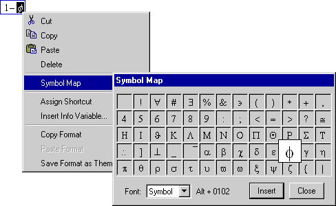
Figure 1: An example of a symbol being entered into an Origin
text label using the Symbol Map while in in-place edit mode
To create the graph shown, three separate graphs were first created in separate layers in a single graph window and aligned using the Snap Layers (Axes) to Grid feature. The graphs created were:
- A single layer graph called "potential" - To complete
the graph, the top X and right Y axes for the layer were enabled,
text labels were added, and a legend was included. The symbols
seen in the various labels were inserted using Origin's Symbol
Map (Figure 1), accessible while in in-place edit mode.
- A two layer graph called "1.48 kV radial densities"
- This graph was augmented in the same ways as the first graph.
However, the right Y axis for the first layer did not need to
be enabled since a linked right Y axis [layer] was added. This
graph is known as a Double-Y graph. The layer represented by the
left Y axis contains the Total radial density data, while the
layer represented by the right Y axis contains only the Kinetic
radial density data. Notice that the Total data and the Kinetic
data are superimposed even though they differ in magnitude by
more than a factor of 10. In addition, arrow objects were added
to label directly specific data plots.
- A single layer graph called "transverse profiles"
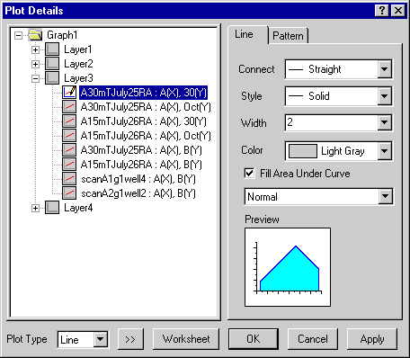
- This graph was refined by enabling the Fill Area Under Curve
option in the Plot Details dialog box for several of the data
plots (Figure 2). Once enabled, various Fill Colors and Patterns
were set. Note particularly that the "blank" areas under
the filled bands were created by using a fill color which matches
the background. In addition, like the first graph, the top X and
right Y axes were enabled for the layer. Finally, several text
labels and arrows were again included.

Figure 2: Origin's Plot Details dialog box showing the Fill
Area Under Curve check box
| |

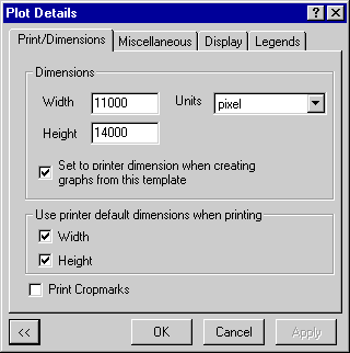
Figure
3: The Graph Page) level in the Plot Details shows the Dimensions
group defined using the pixel Unit setting. |
Defining a Pattern
Finally, the researcher established, heuristically (through trial
and error), a sequence of steps for producing similar, journal-quality
figures.
These steps included setting the page size in pixels to give a
repeatable bit map size (Figure 3) and using the Export Page function
to create (600 dpi) PDF files, which were subsequently converted
using Adobe® Photoshop® into other
standard formats.
Note: Although not used here, the researcher often employs the
spline connection type for interpolation of sparse data. This feature
can be found in the Axis dialog box.
Biography
Chris Dobson
is a research scientist at the Propulsion Research Center at NASA/MSFC.
The graph shown is property of the Journal of Applied Physics.
C. C. Dobson and I. Hrbud, J. Appl. Phys. 96, 94 (2004).